
Local AI misinformation classification system.
My bachelor's thesis at the University of Lübeck.
My bachelor's thesis at the University of Lübeck.
Development of a browser extension for
to display warnings about misinformation
Development of a browser extension for X to display warnings about misinformation
Bachelor Thesis
My bachelor's thesis at the University of Lübeck.
Fact-checking on social media is slow and selective — a few posts get a note, the rest scroll by unchecked. This thesis explores the opposite: a clear, explainable credibility signal on every post. The result is a browser extension for X that classifies posts in real time with a large language model running entirely on your own device, so nothing ever leaves your browser. Each post is sorted into one of five categories and explained through layered, tap-to-reveal detail. Built with a human-centered design process and tested head-to-head against X's own Community Notes, it was judged more transparent, more systematic, and harder to manipulate.
Highlights

Classification
Five categories.
One clear signal.

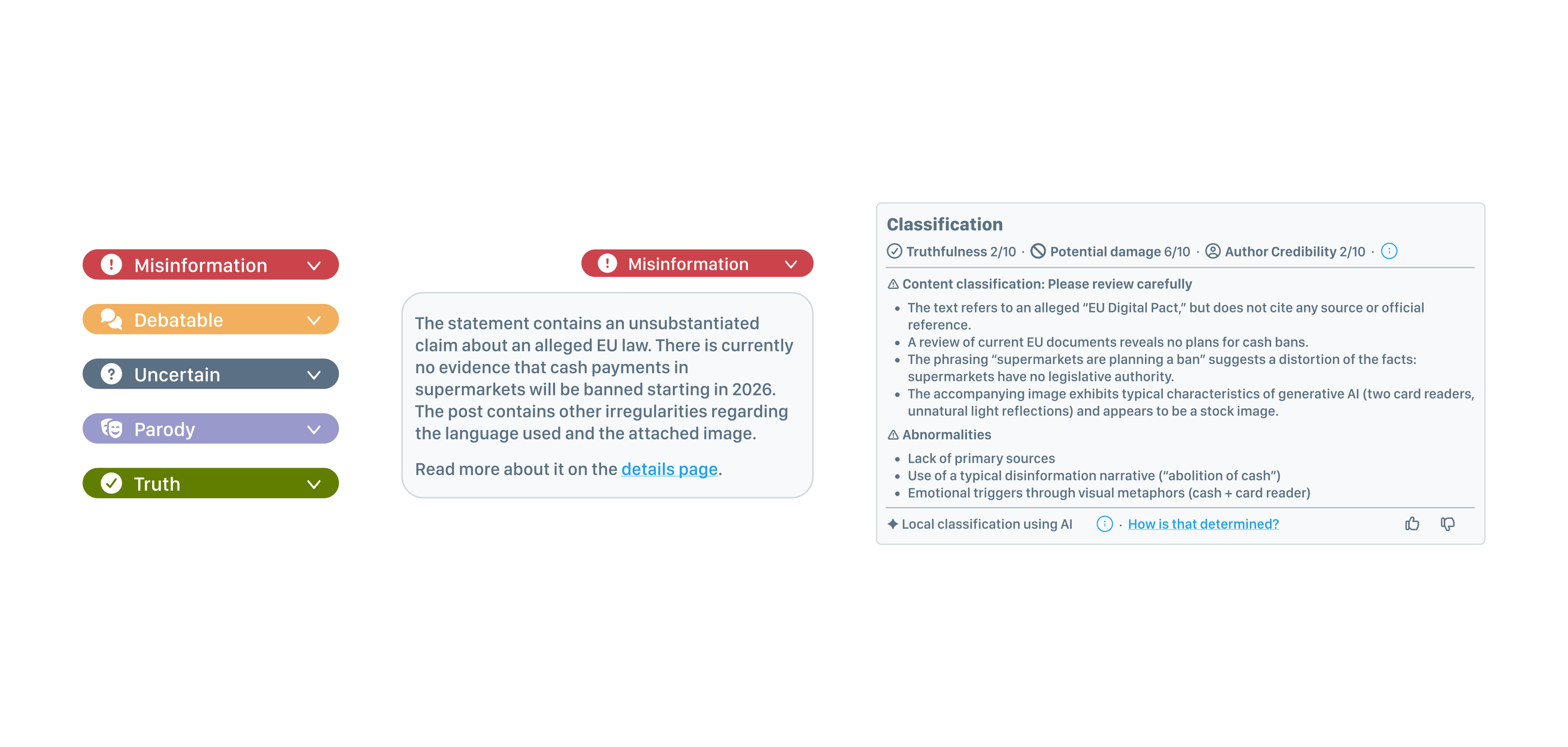
Five verdicts, not two. Real claims rarely split cleanly into true and false. Every post is sorted into one of five categories — True, False, Disputed, Unclear or Parody — so nuance is never forced into a binary.
A scale, not a switch. The five categories sit on a single spectrum, each carrying its own colour and icon, so a verdict registers at a glance — before you read a single word.
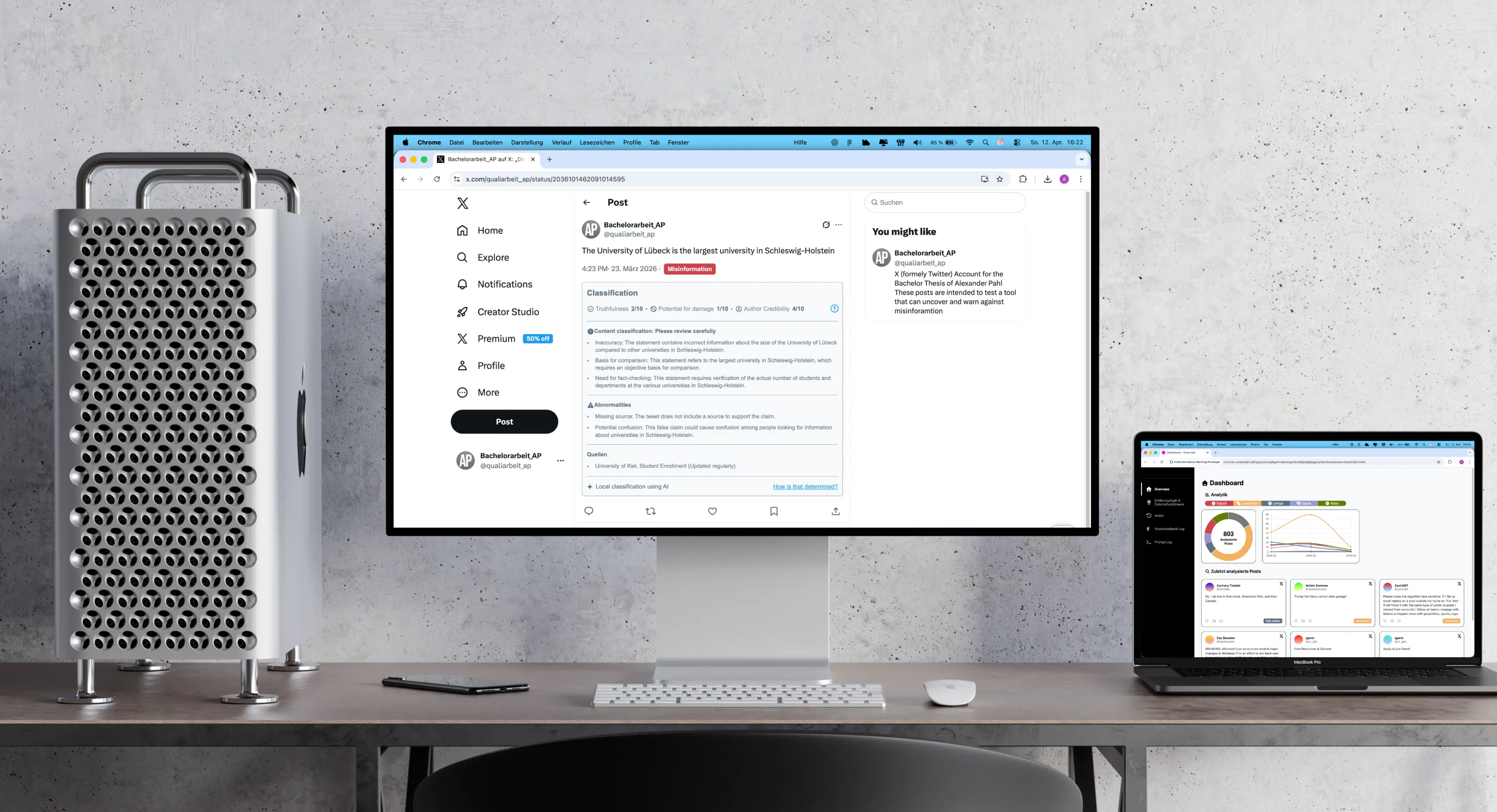
On-device by design. Classification runs on a language model built into the browser, on your own machine — post text, images and prompts never leave it. Declared ads and parody accounts are filtered out before the model even runs.
Tap to go deeper. Progressive disclosure keeps the feed calm: a compact badge first, a one-line reason on tap, and a full detail card with analysis, red flags and sources only when you want it.
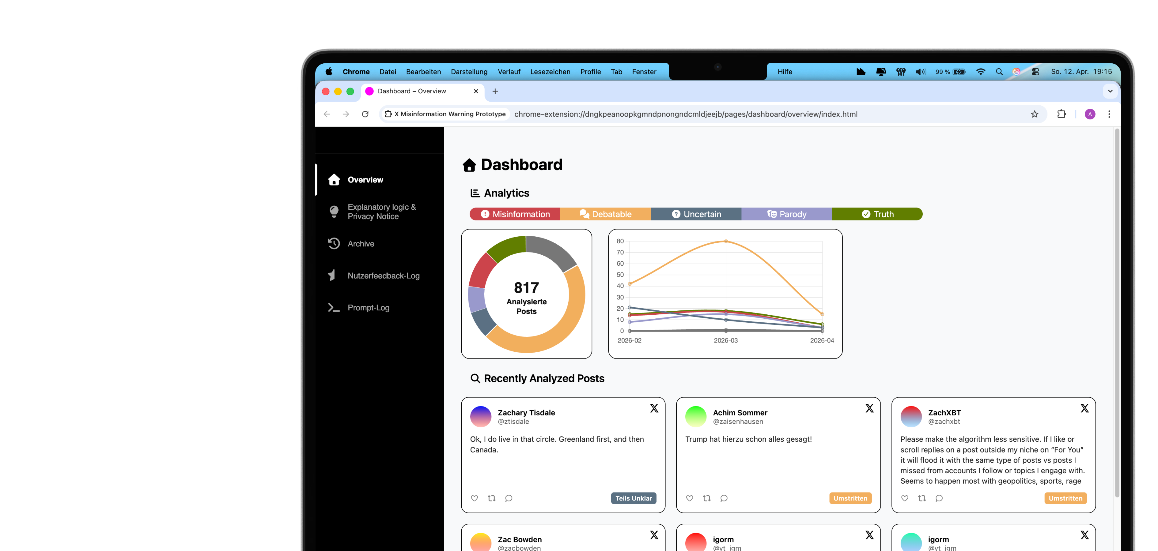
Measured, not just labelled. When a post is flagged false, it is scored from 0 to 10 for both truthfulness and harm potential — turning a single verdict into something you can actually weigh. Other categories stay deliberately unscored.

Credibility, earned over time. From at least three classified posts, an author's recent history is aggregated into a credibility signal, weighted toward newer activity — context that no single tweet could ever give.

It reads the picture, too. When a post carries an image, the model describes it and weighs it against the words — catching the cases where a visual quietly contradicts the claim.
Built for every kind of sight. High-contrast, colour-blind and icon-only modes keep every warning legible — and no verdict ever leans on colour alone to make its point.
The Research
A human-centered process.
Ten users put it to the test.
A method, not a hunch. The whole project followed the ISO 9241-210 process for human-centered design — analyse, conceive, build, evaluate, then loop back — so every decision traces to a user need rather than a guess.
Grounded in the literature. Three systematic searches across Google Scholar, the ACM Digital Library and Scopus narrowed hundreds of hits to a handful of core sources — setting how the warnings should look and how they should explain themselves.
Explainable by construction. The interface is built on established explainable-AI principles — naturalness, responsiveness, flexibility and sensitivity — with progressive disclosure as the organising idea, so explanation scales with the reader's attention.
A score I could defend. A functional test exposed the numeric score: reliable once a post was already judged false, but scattered on neutral content. So scoring was deliberately limited to false posts — a constraint, made honest.
Tested early, changed often. A formative evaluation of the Figma prototype reshaped the system: two categories were added, high-contrast and colour-blind palettes introduced, and the dashboard rebuilt around clearer explanations.
Studied with real users. A summative, mixed-methods study (n = 10, within-subjects) in the usability lab paired think-aloud sessions and interviews with a multidimensional trust questionnaire — and put the extension head-to-head with X's Community Notes.
The verdict on trust. Overall trust landed at 3.44 out of 4, strongest on usefulness and intention to use. What participants described as trustworthy was consistent throughout: every post judged by one visible, unchanging logic.
More trusted than Community Notes. Against Community Notes, the extension was judged more transparent, more systematic and less open to manipulation — their selectiveness bred doubt. With only ten participants, the findings point a direction rather than settle it.
What's next. The thesis maps the road ahead: a prompt and feedback log for full auditability, an optional choice between local and cloud models, and explanations that adapt to each reader.